
Subito Illustration system
A 40+ spot illustration system for Subito and Subito Motori, mapped across the customer journey. Built on realism, sharp shadows and white space.
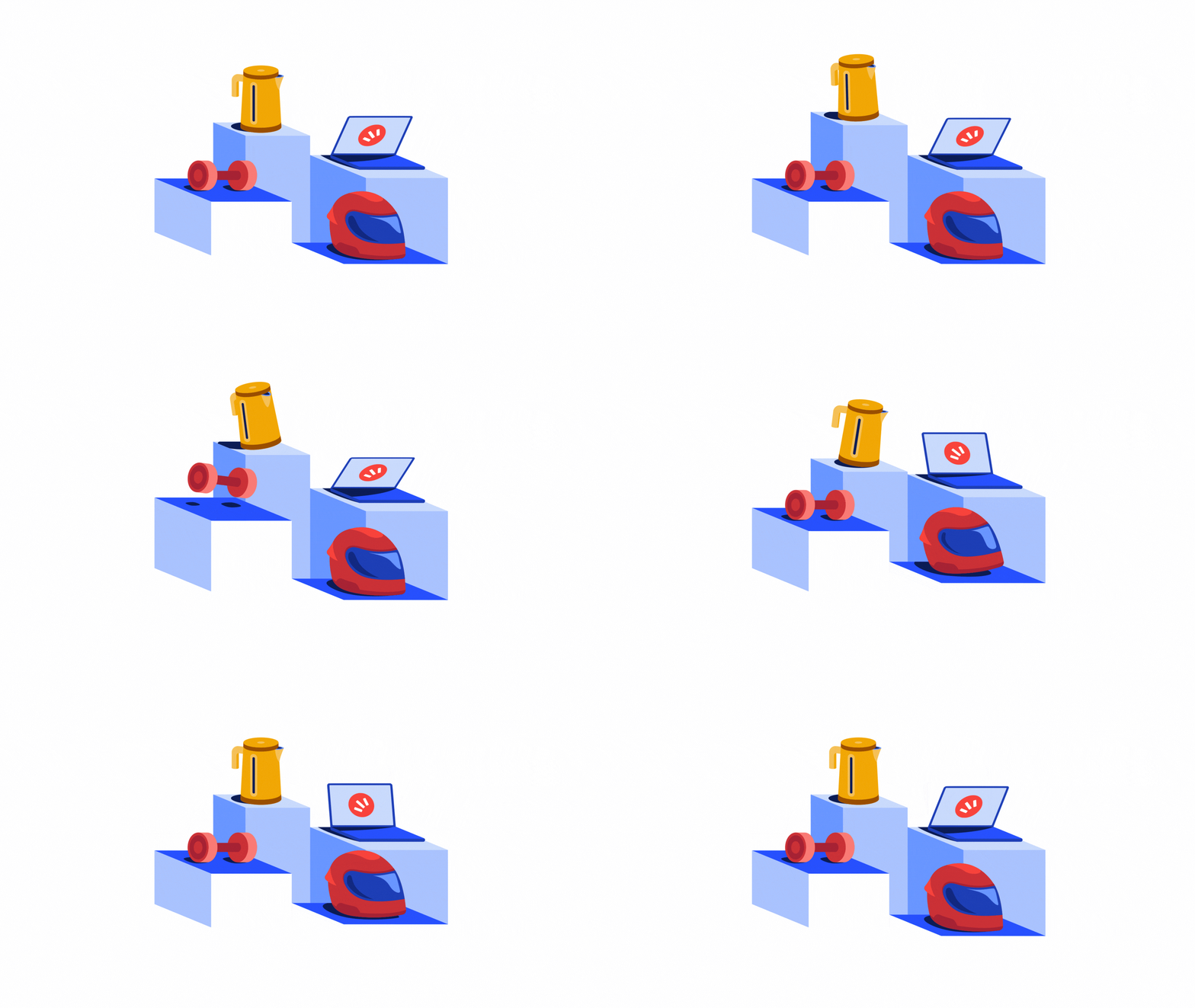
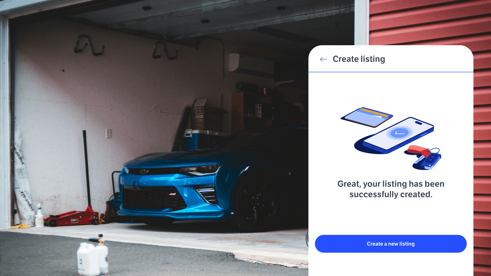
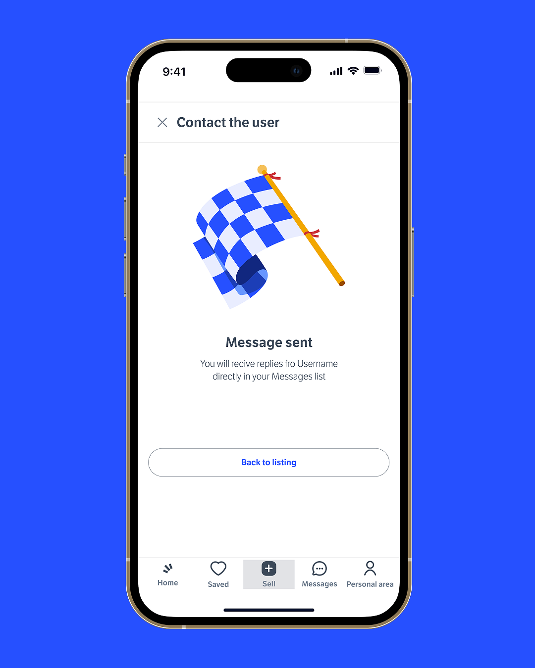
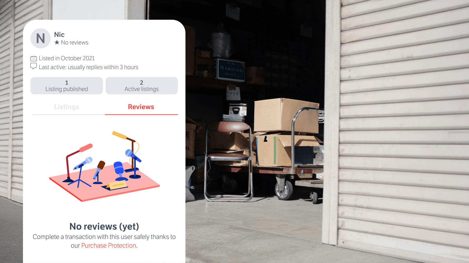
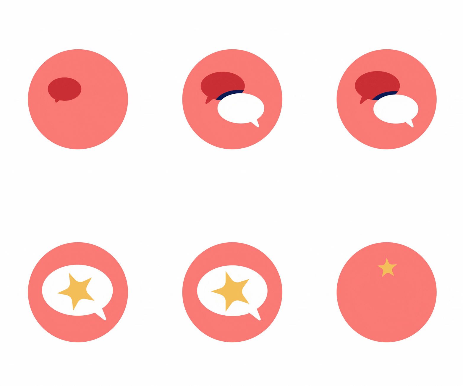
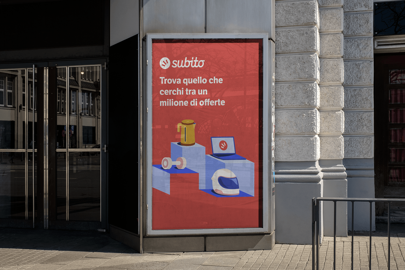
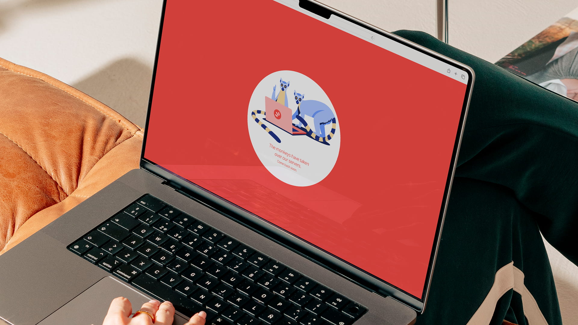
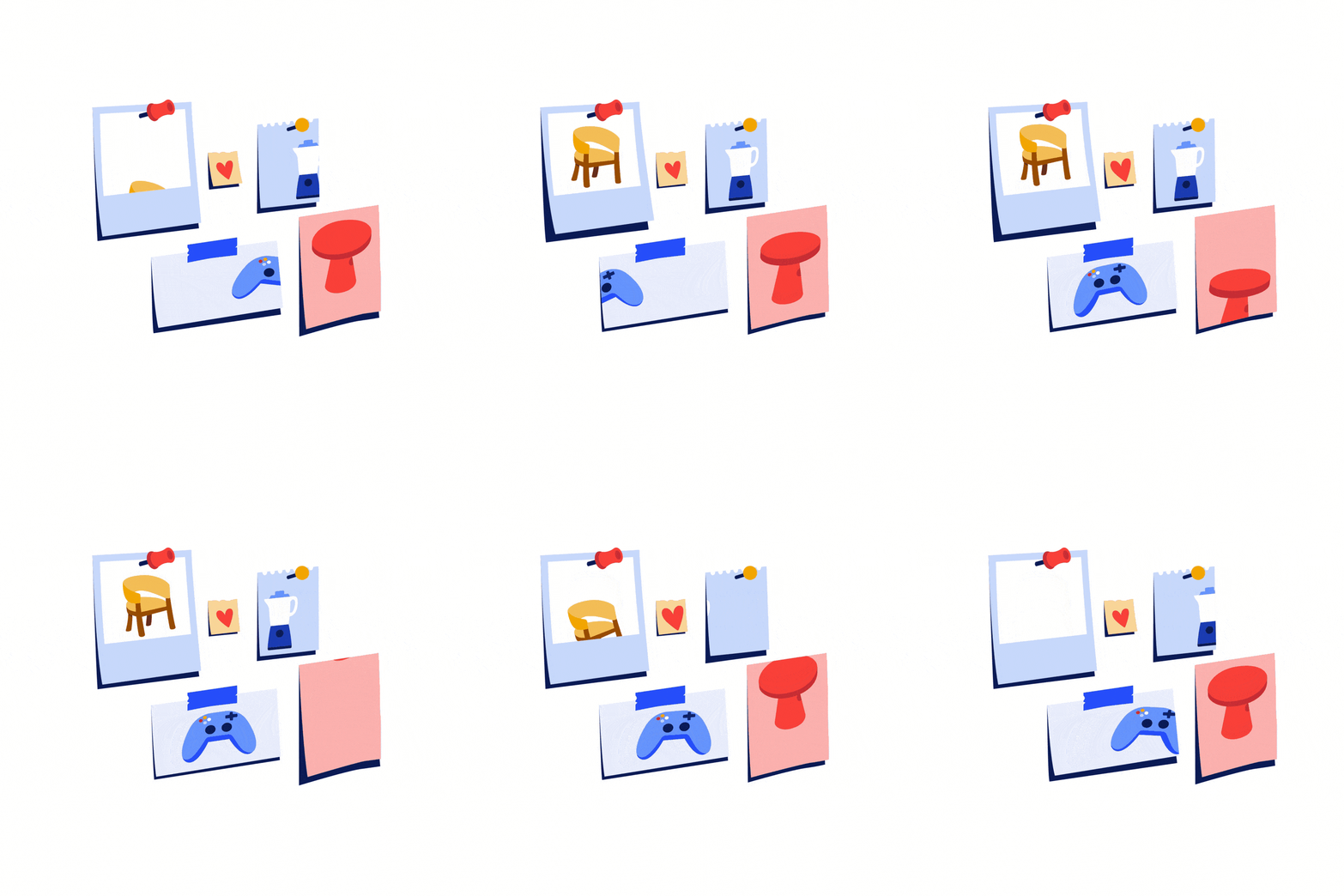
We worked with Subito's full color palette, starting from blue, the lead color for Motori, then extended across the wider asset set. The system counts 40 spot illustrations, 10 of them animated, plus a logo animation, all designed to fit a defined space inside the app's UI: a square frame we couldn't cross. Inside that frame, we decided to make the object the protagonist. No phone screens or interactions filtered through a device, just items crafted with enough detail to be recognised at a glance. We opted for a quiet form of realism: clean and precise in execution, more metaphorical and snappy in concept. Sharp shadows give objects weight and dimension, while white does the architectural work, suggesting buildings, streets and depth without ever drawing them. Objects stop being thumbnails and start being signposts: small, recognisable, quietly guiding people through the marketplace.
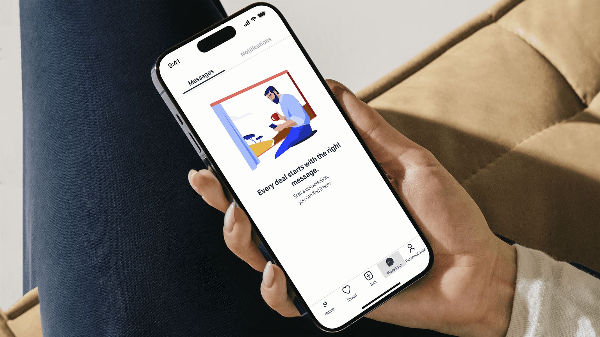

Subito Motori is where the marketplace makes its most ambitious move, a category built around higher-value purchases and a more focused audience. Blue, the channel's signature color, became the connective tissue of the whole system: starting from cars and motorbikes, it extended across the wider asset set, carrying a more adult, performance-driven register without ever breaking the shared illustrative language.










Credits — Creative Direction Cristina Pasquale + Illustration Sofia Buti & Alessandra Marin + Motion Lead Fabio Orlando & Miguel D'Errico + Technical Direction Matteo Ruffinengo & Fabio Orlando + Producer Laura Mazzarino + Portfolio Case Study Giovanna Crise & Elena Maggiolo — and for the Subito team: Creative Designer Paola Cosenza + Senior Product Designer Nicola Grandi