
Google Illustration system
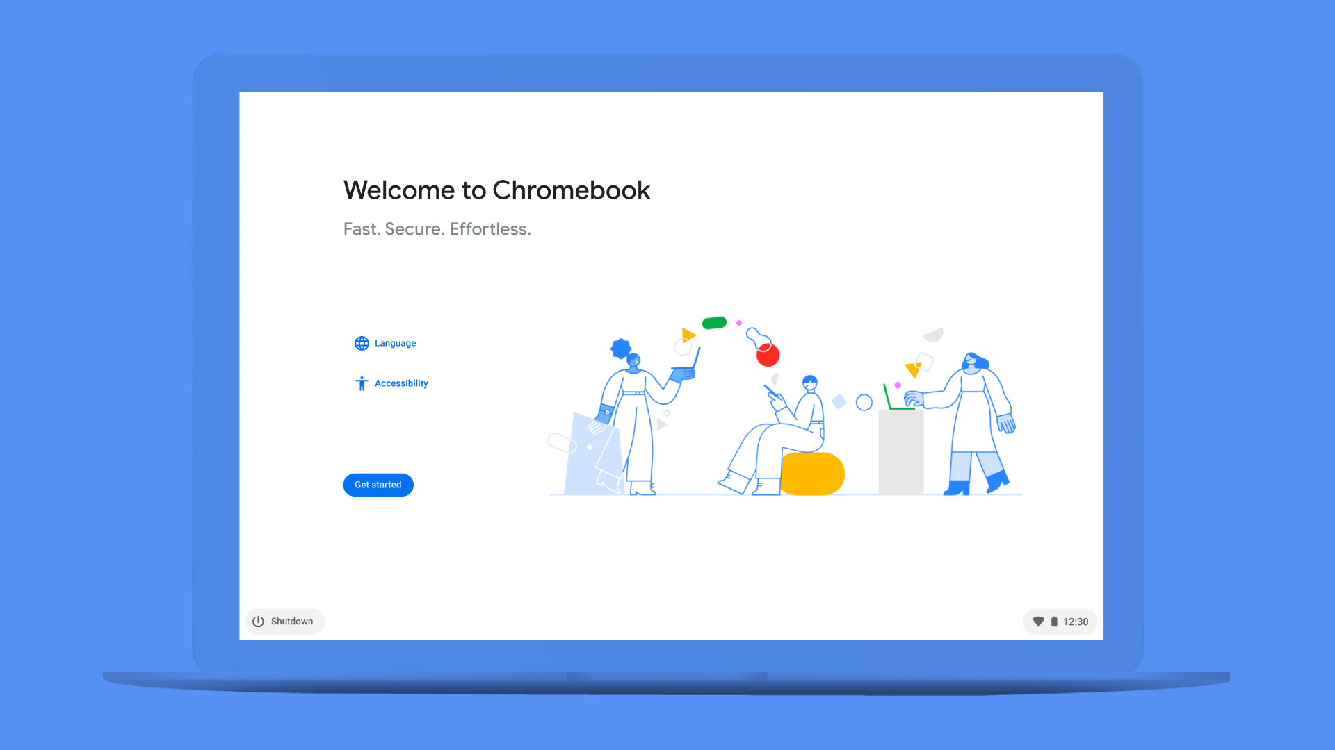
We created an intuitive illustration system to empower and guide Google Chrome OS users throughout their entire digital experience
The project spread over the duration of six months, with plenty of time for research and fine tuning. In the end, each and every asset contributed to a library striking the right balance between brand coherence and a mindful user-centered approach.
Check it on — Behance Illustrator Bedge + Stash Media Google Chrome OS Illustration System Case Study by Illo
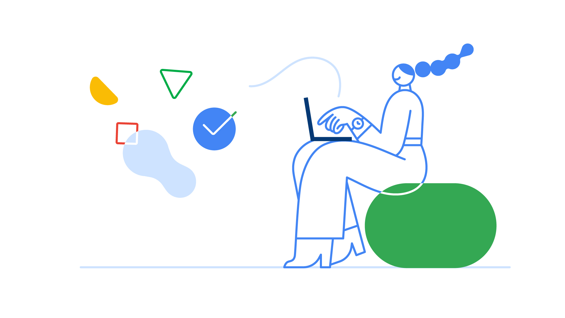
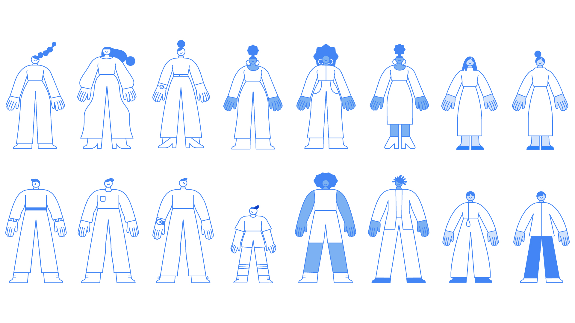
Diversity, inclusivity and scalability were at the heart of the character designs we created, keeping in mind the necessary alignment with the Google brand identity. We covered multiple situations, going from an abstract approach to a more realistic one for more functional contexts. We also animated some of our characters, adding an extra spark of dynamism to the whole library.
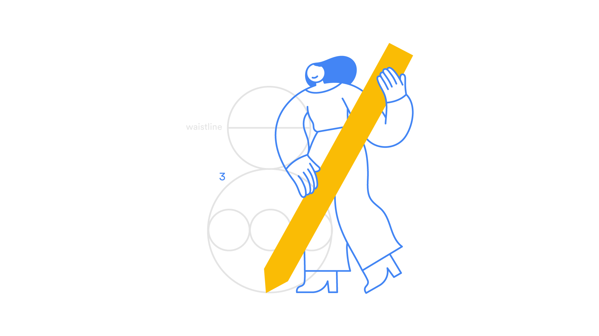
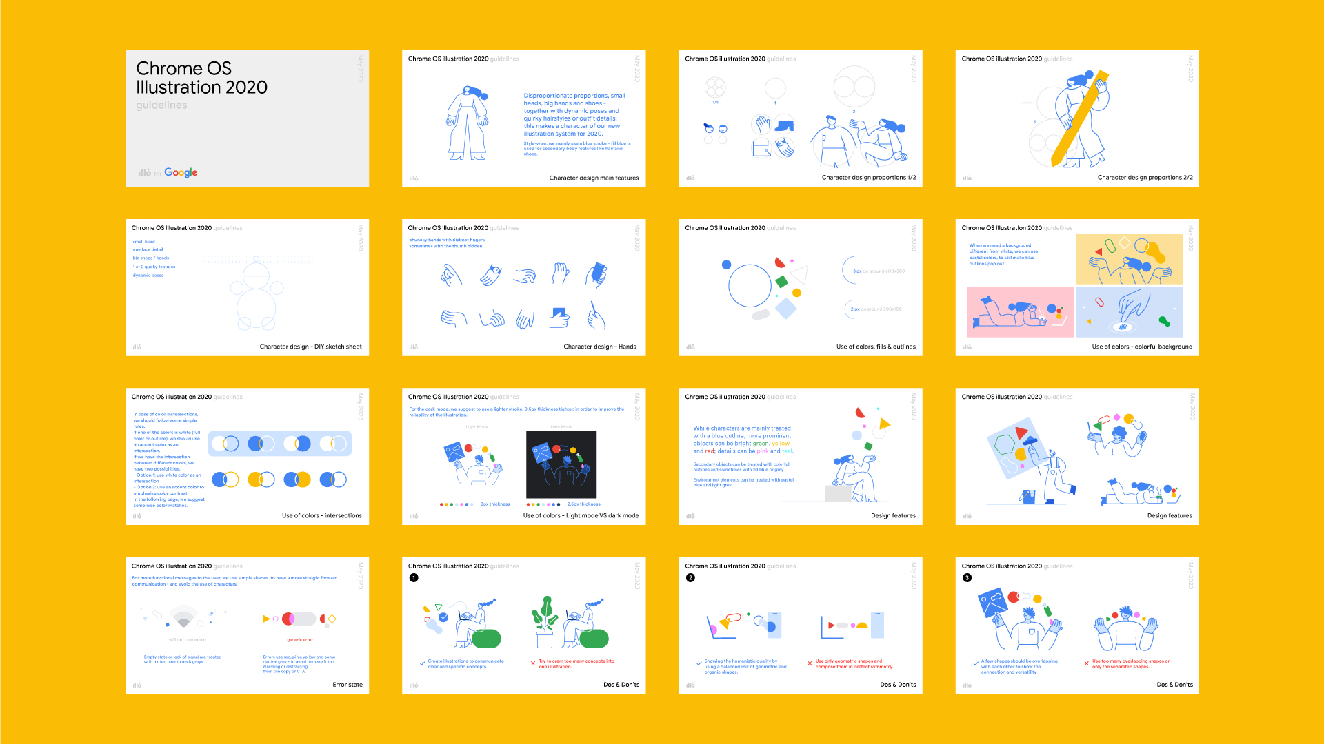
For every illustration system we design, we make sure to create and share specific guidelines with the brand’s team, allowing them to create future assets that would perfectly fit their current scenario. From ratios to various Dos and Don’ts, we make sure to cover the essential guiding principles for a coherent, constant and functional look.
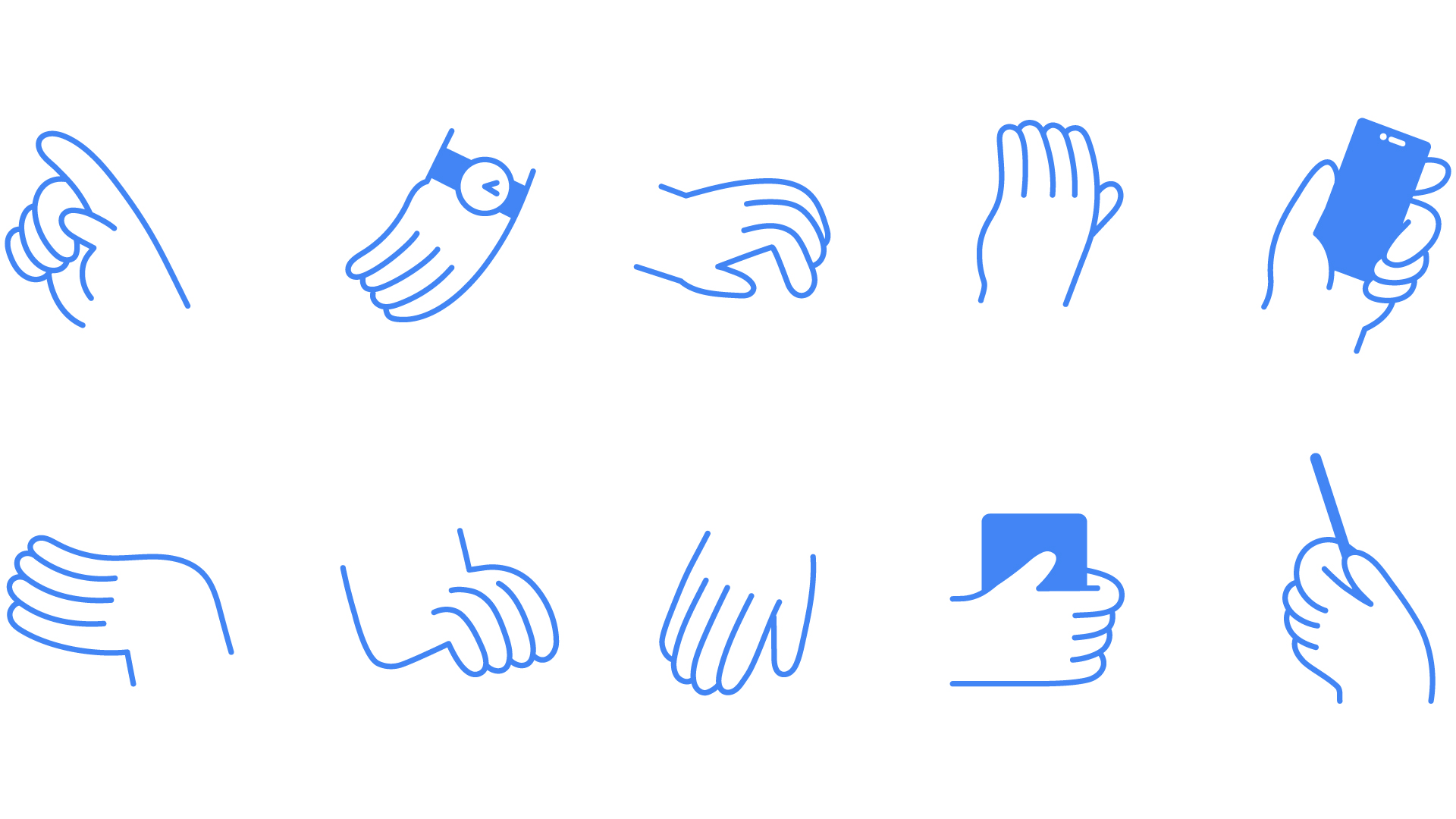
We had fun designing hands and gestures that would render and setup the onboarding phase and the interface easier to navigate for users. Animation always helps so we applied our motion design magic to some of them as well.
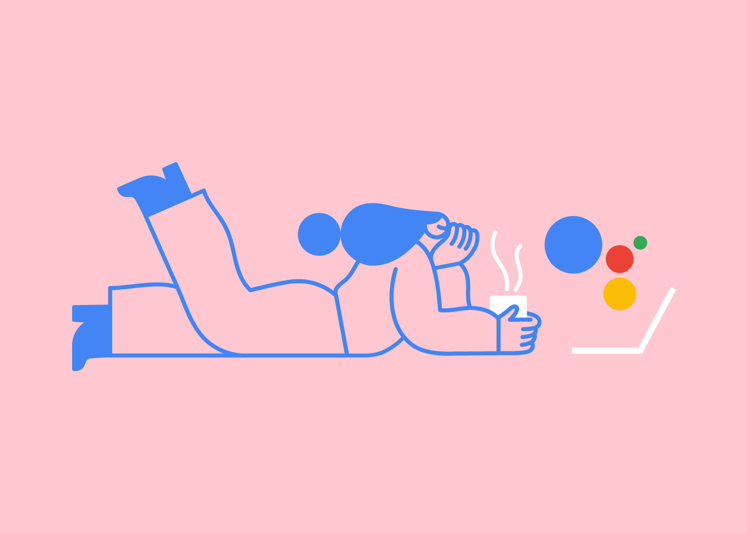
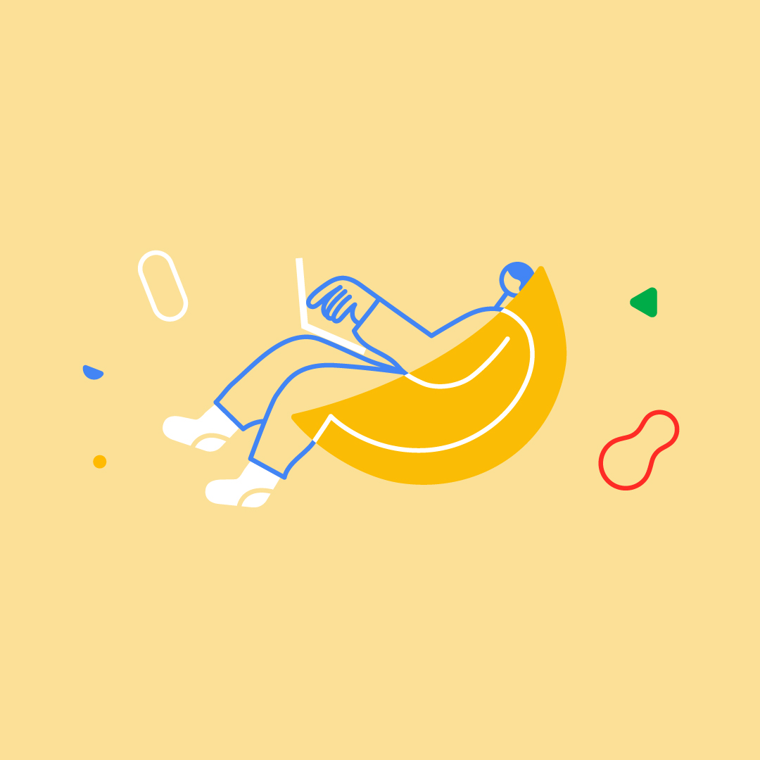
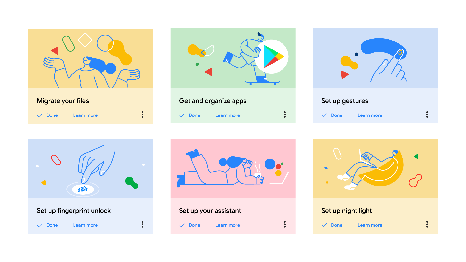
We created a range of minimal spot illustrations available in two different color palettes: various shades of blue or multicolored.
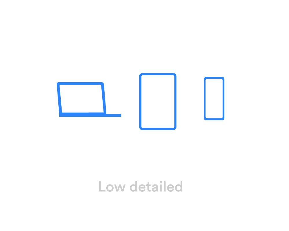
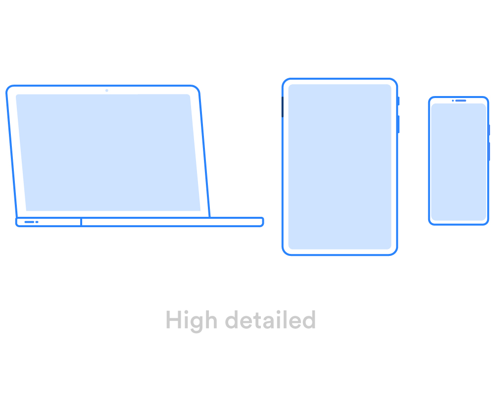
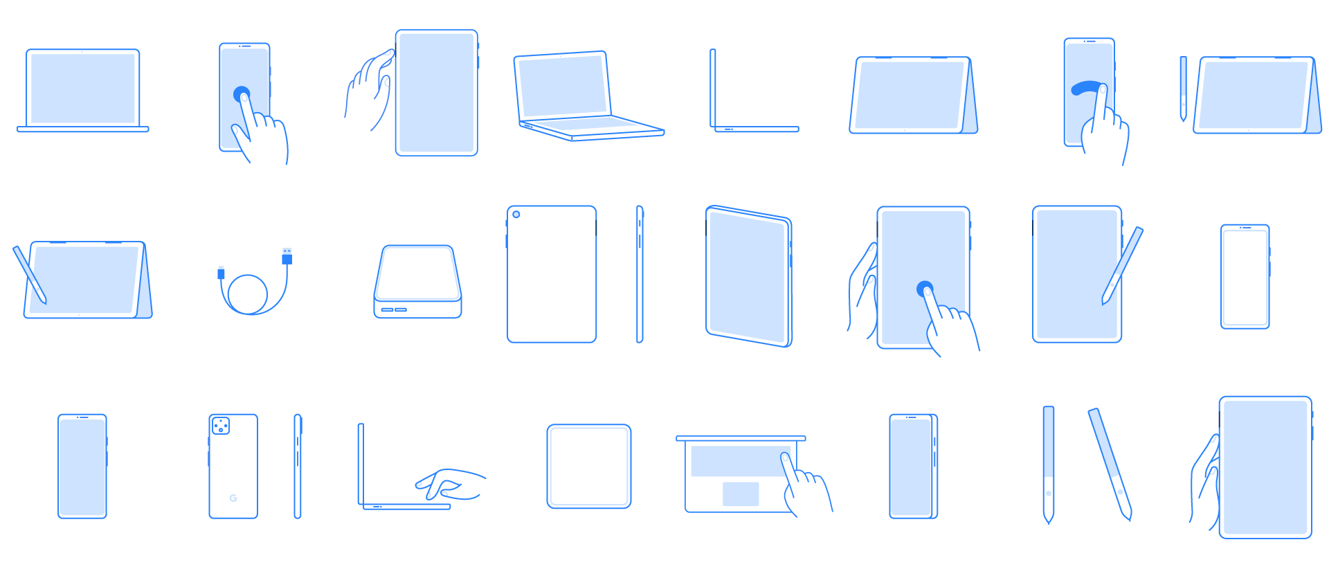
Google has an impressive family of products and devices and we got to illustrate plenty of them for this project. We explored two different approaches: a detailed, close-up version and a simpler, more minimalistic one to suit the smaller devices or bird’s eye views.
Welcome to the dark side - it’s been an exciting opportunity to develop this illustration system both in a light mode and a dark one. It was the first time we were entering dark territory and we had fun adjusting outline weights, skin colors and an array of other details for each of the two modes.
Credits — Creative Director Ilenia Notarangelo + Art Director Cristina Pasquale + Illustration Sofia Buti + Design Exploration Arianna Cristiano + Animation Lead Laurentiu Lunic + Animation David Cubitt + Client Director Luca Gonnelli + Portfolio & Video Case Study Giovanna Crise + Google team – Visual Design Direction Elizabeth Chiu + Motion Direction Minjoo Cho